
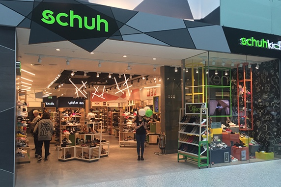
Schuh was my first time working in-house as a designer (previously I'd been freelance and working in a studio) and I got to work on a wide array of products and really see the impact that design can have on a business first hand.
Addressing new customer behaviour
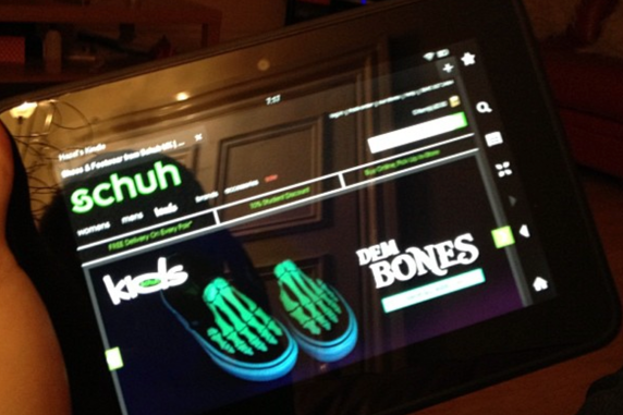
Back in 2011, mobile traffic was growing and I was tasked with designing the mobile version of Schuh.co.uk.
We had to make some decisions around making the current site responsive or making a mobile site from scratch, because the mobile site had been tested before and cost a lot of money - the business was sceptical that this was still the right move for an online retailer. So we choose the path that would offer us the fastest way to develop the idea, and give us the ability to build a custom experience for mobile users - a standalone site.
The goal was to make the mobile site look like the desktop site keeping it on brand while adapting some key things like the navigation, information hierarchy, and adding mobile interactions so that it was as easy as possible to find what you were looking for and purchase your shoes.
The mobile site quickly took traffic from the desktop site and began to convert at a higher rate, as a nice added extra I was able to send a personal note to our first mobile customer thanking them and refunding the cost of their order.
Increasing conversion by 30%
We started to explore A/B testing with some of the ideas and features that we we're rolling out and not just relying on qualatative feedback. This allowed us to quickly iterate and improve the product and keep us moving in the right direction.
I would often do a UX Audit of the product, going through it and making sure it's accessible and usable, not just on my own but reviewing user research videos (usually remote testing) to help spot some errors of friction points that we could work on.
We saw that users were confused and stalling at the first page of the checkout, no clear problem to the user but the hesitation there hinted at this not being as clear as it could be. We checked GA to see if there were any signals here and could see that there was a larger bounce rate here compared to other pages and a large drop-off of users in this part of the funnel.
We didn't require users to have an account, but this is the page where we offered them the ability to login, or if they were a guest - using the same form - they could enter their email and select the radio button for "no password".
After some brainstorming, I came up with an easy change that wouldn't take long to implement and would validate if this was the main reason for the drop-off. I split the "login" and "guest checkout" into two forms side by side and make it super clear for users.
The outcome of this change was a 30% increase in conversion, which is huge for this size of online store. It also helped steer us to look through GA for similar metrics and run a similar line of experimentation throughout the funnel to add clarity and reduce friction.